Digital
Haberdashery
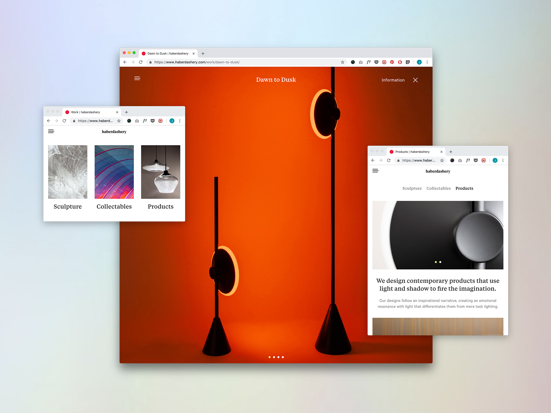
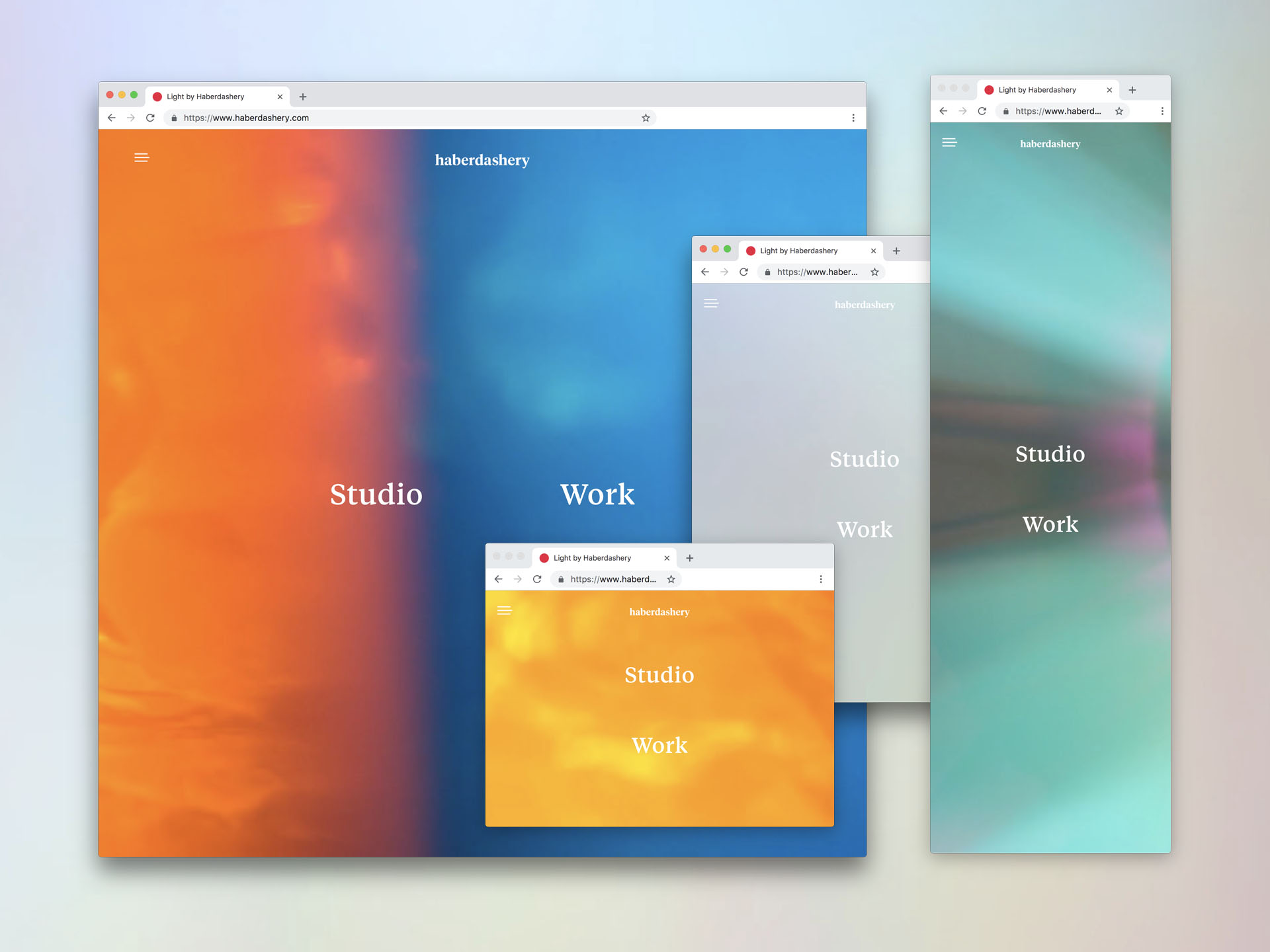
Haberdashery is a design studio using the power of light to create landmark sculptures and innovative lighting products for ambitious architects, interior designers,brands and institutions.
In 2018, Haberdashery Studio officially turned 10. So we set out to give its brand a refresh and redesign its website.
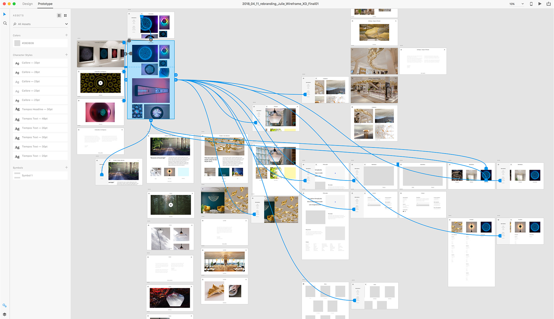
We started by analysing what makes Haberdashery stand out, and why the current website wasn't relevant anymore. We organised workshops and gathered insights with marketing team and diverse clients and employees to understand the depths of Haberdashery's online purpose. We collaborated with a team of developers for the site development, who built a custom CMS to help facilitate copy updates.
As an in-house Graphic Lead, my role was to oversee and creatively lead the entire project, from initial concept to UX and design to production and roll-out .
Visit Haberdashery’s website
Visual Storytelling
Amaranthyne
How can we visually and emotionally connect
a sculpture to its geographical and culture heritage?
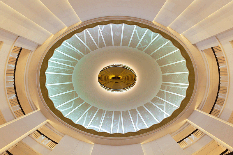
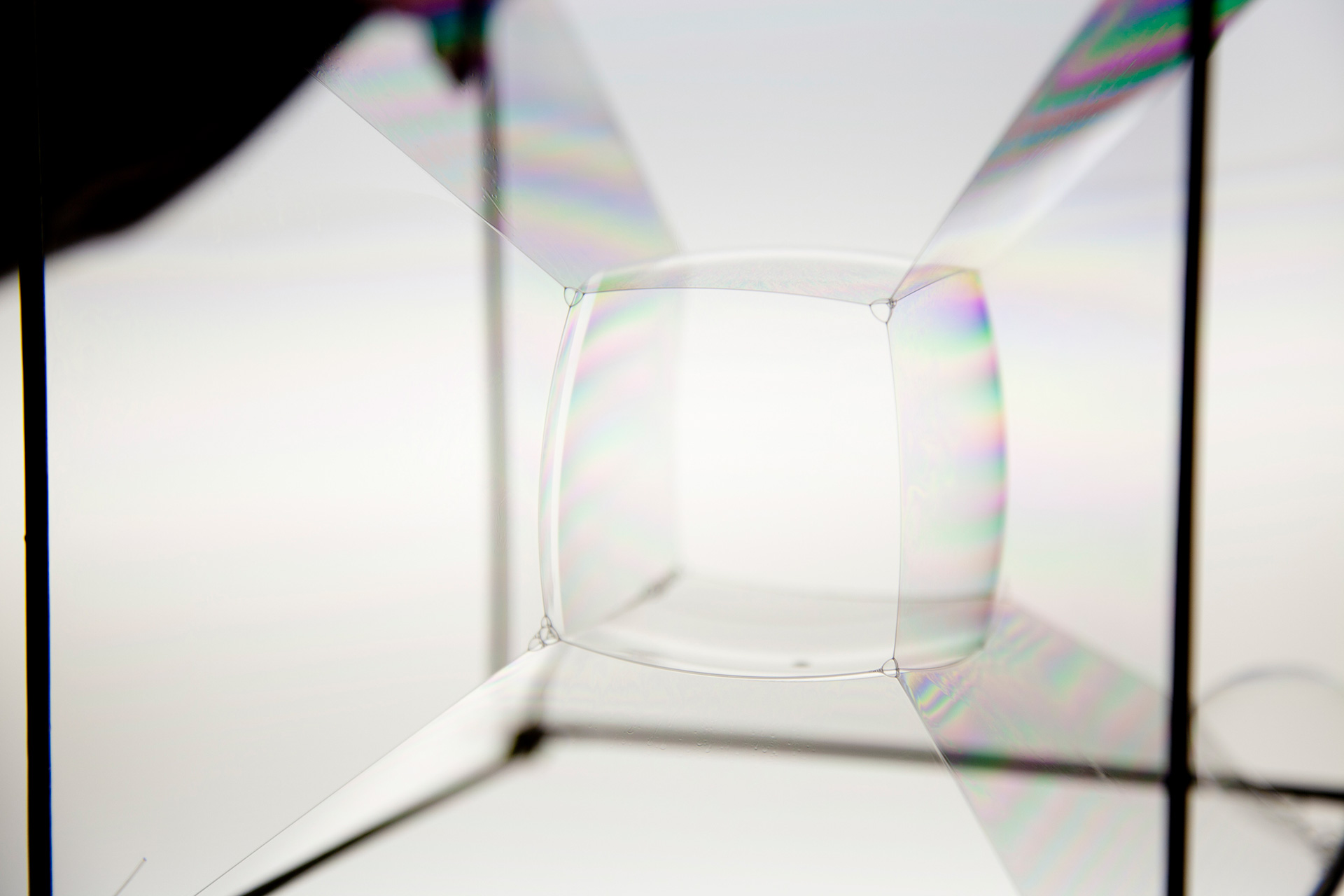
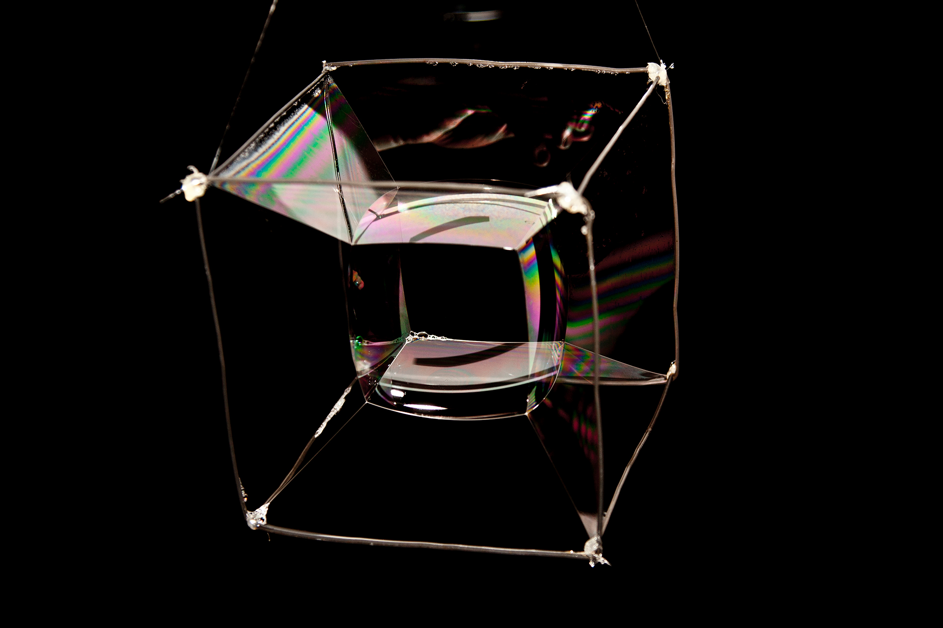
Clarges Mayfair is a prime residential development built by the British Land Company. With protected views over Green Park and Buckingham Palace, the building’s design and architecture is rooted in the belief that the rich tradition and character of Mayfair must be respected, while also allowing for a considerate dialogue between old and new. Amaranthyne - the atrium feature and centerpiece located in the main entrance - celebrates the history of artisanal crafts and recreational pastimes of the area, through complex layers of lighting, colours and illustrations.
As an integral part of a team of designers and engineers at Haberdashery Studio and in collaboration with interior designers and architects, my role as a graphic designer and colour specialist was to research and visually translate the essence of Mayfair into simple, yet powerful illustrations and lighting cyles.
Amaranthyne was nominated for the Frame Award 2018 as Nominee for the Best use of Light

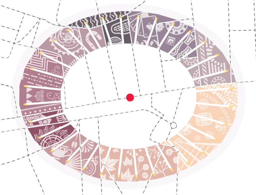
Through a 31m circumference illustrative frieze comprised of 32 decorative panels altogether made of over 200,000
hand-adjusted surfaces reflecting light and colour, this highly narrative driven sculpture is paying tribute to the cultural heritage of Mayfair, Picadilly.
Following an extended period of research, testing and experimentation, the final design settled on 9 carefully defined sections, each inspired by visual, cultural and historical references of the area.
Details within the perforated white frieze are revealed and hidden again depending on the viewing angle and the time of day while 4 discreet visual cues referencing the main cardinal points helps the visitor relates to its position in space and time.
The lighting system explores an ever-changing cycle linked to the real-time transition of the seasons outside each and every day.


Art direction
Zootwoman

‘Star climbing’ is the 4th opus by British electro-pop band Zootwoman.
My role was to create a serie of visuals for the LP, CD, singles and lyrics book to illustrate the concept of ‘Star Climbing’.
The album cover visually explores the idea of fragility and ephemeral beauty through material research and photography.
All artworks were hand-made then photographed. No CGI involved.

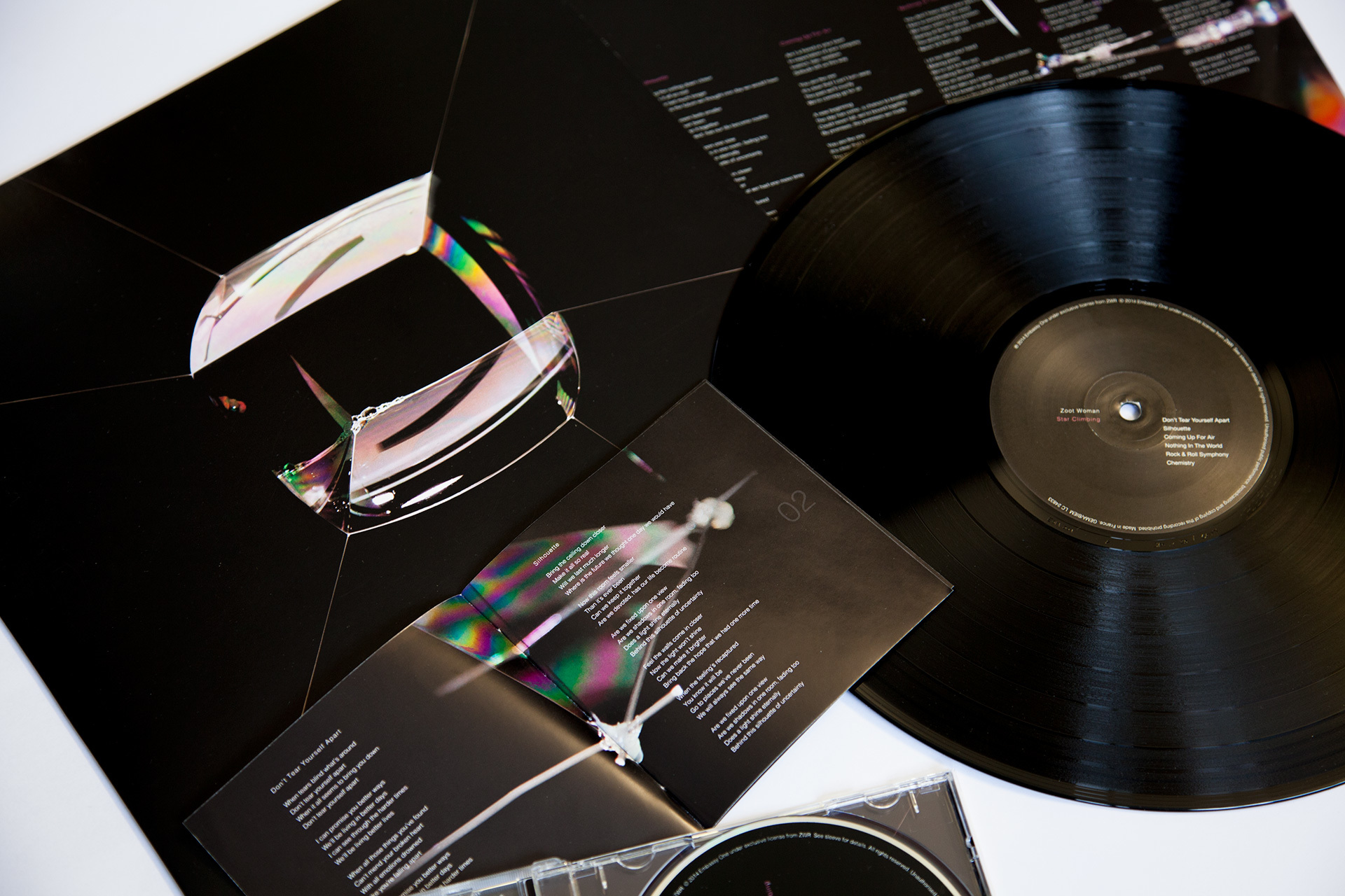
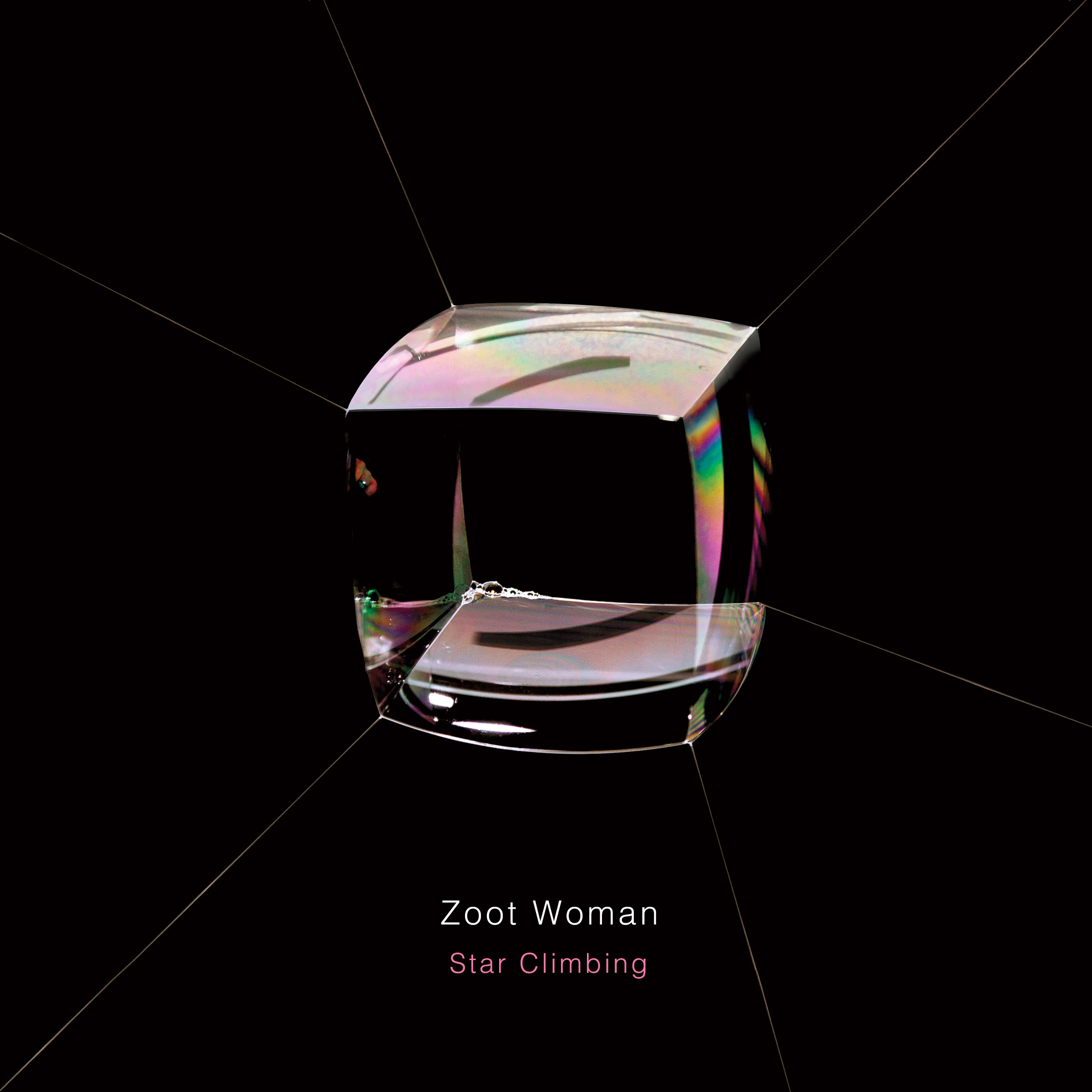


Client: Zootwoman
Services : Concept , Art direction, Photography
Year: 2014
Visual Storytelling
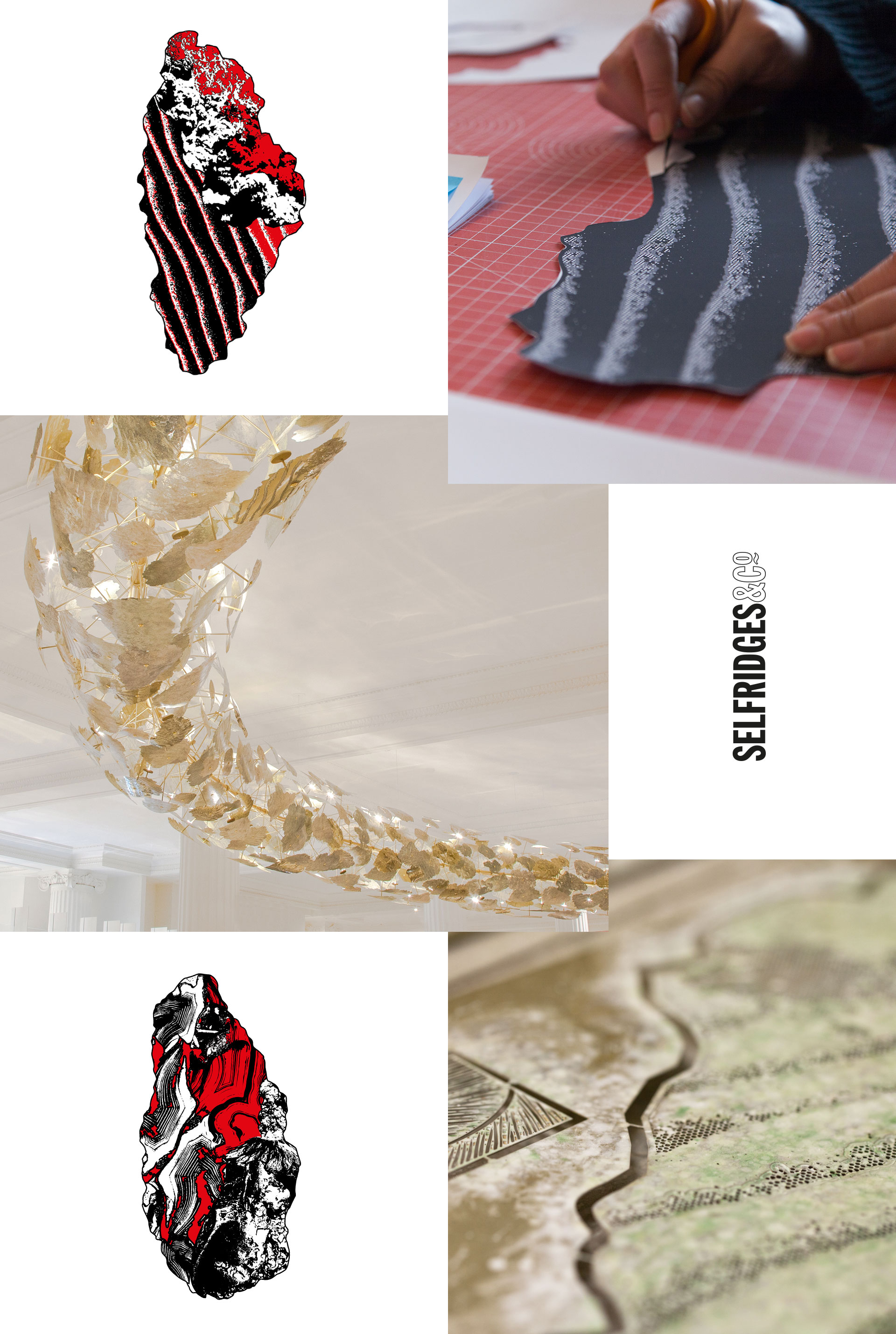
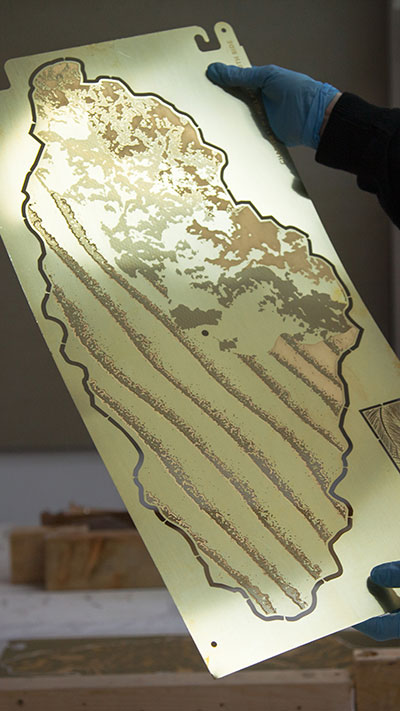
Origin of Wonder
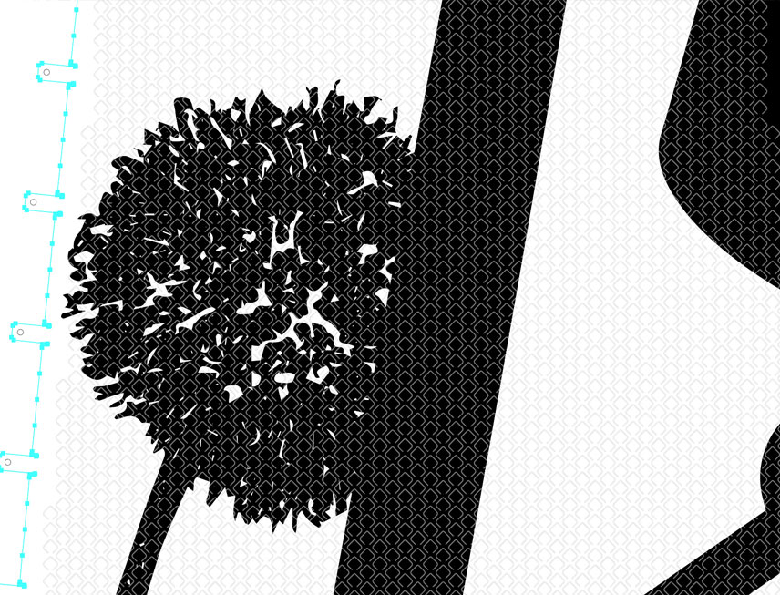
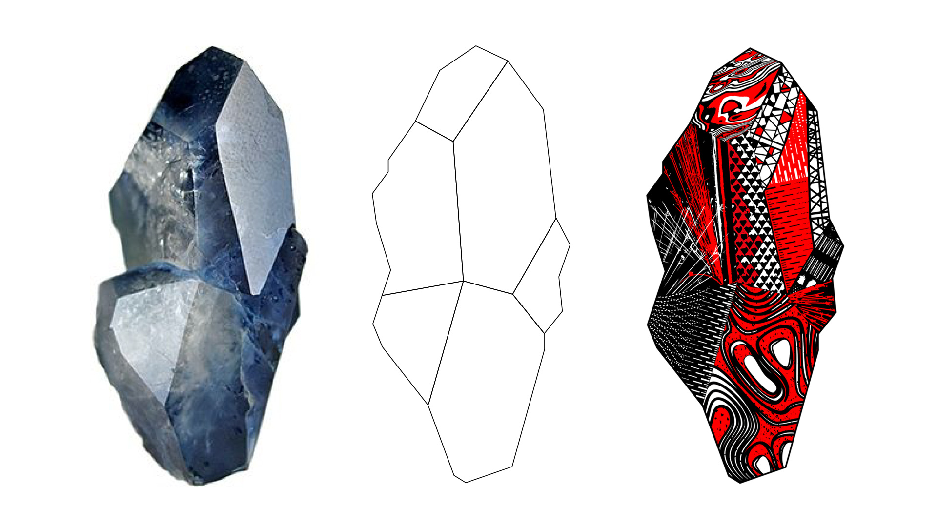
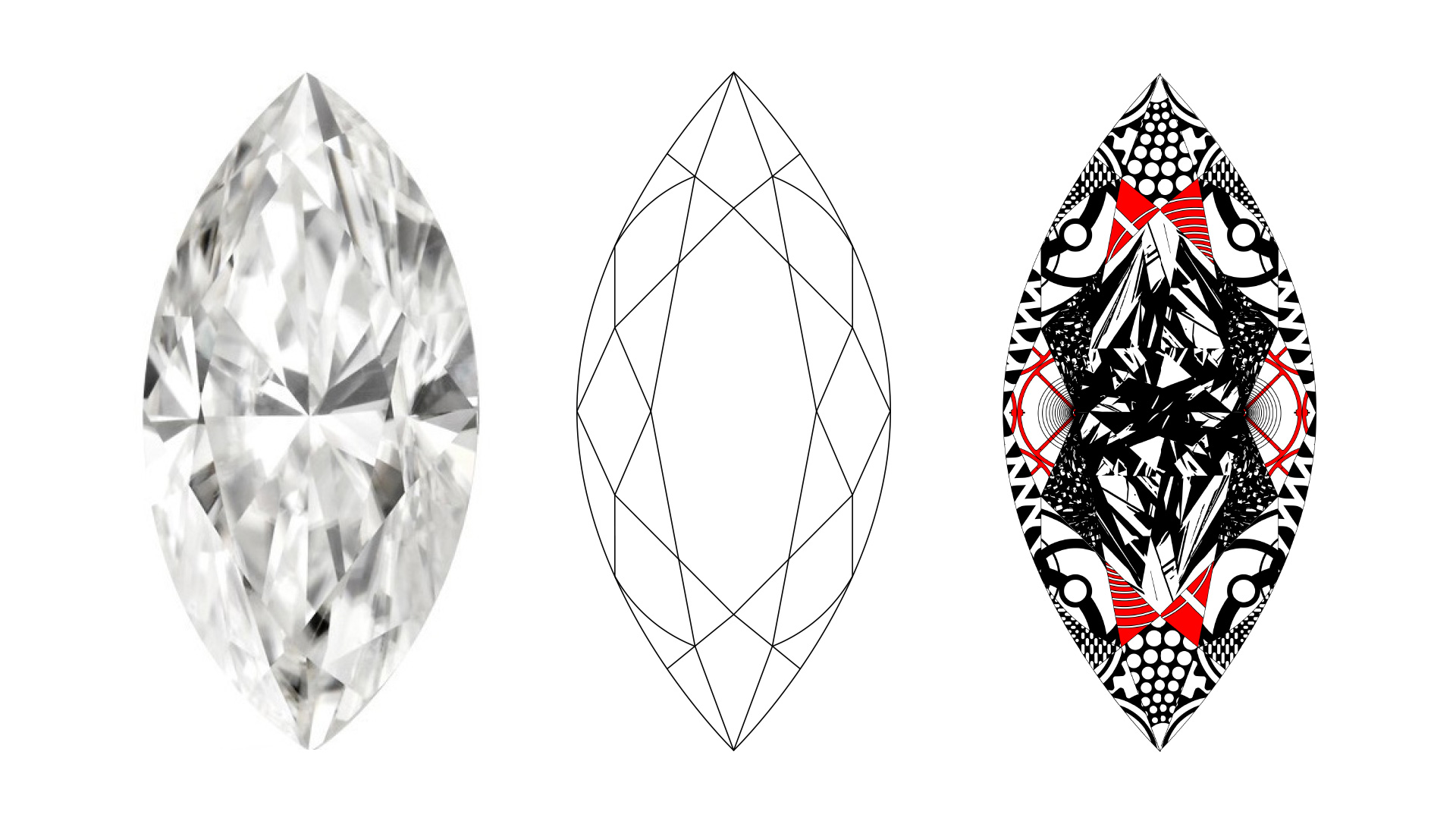
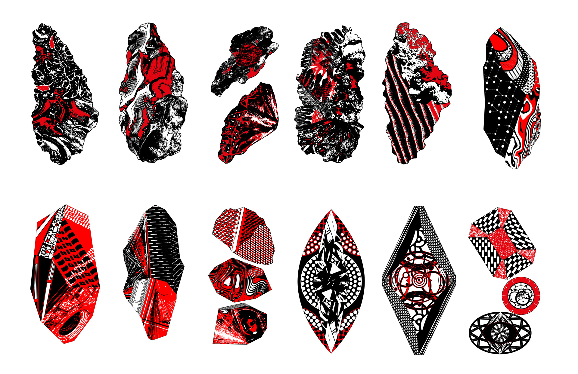
Origin of Wonder is a light sculpture embodying the journey that raw uncut minerals take on their way to becoming the refined and wondrous jewels.
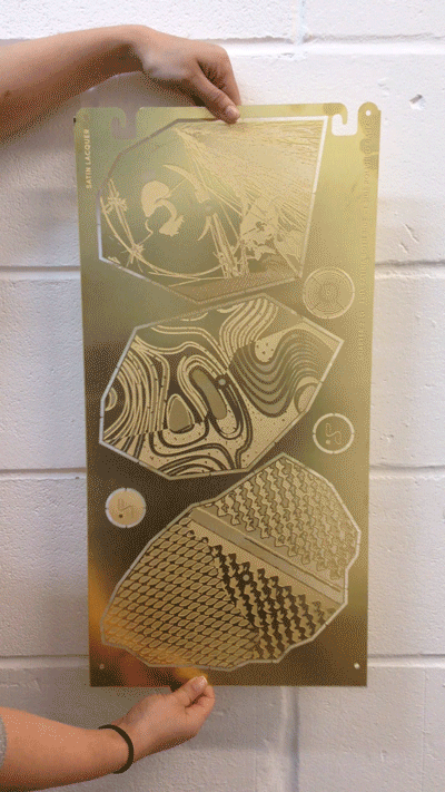
My role as part of the Haberdashery design team involved working on the concept, art direction and design of this narrative-driven sculpture. A total of 17 final different composition have been designed, photo-etched, cut and arranged around a 20m diameter circular formation.
The sculpture flows between three distinct chapters: 'The Origin of wonder', 'Savoir-faire & craftsmanship' & 'The Illuminated article'. It counts more than 1000 brass panels, all underpinning the story of the Origin of Wonder. You can discover the sculpture at Selfridges London in the Wonder Room.
 Graphics research
Chapter 1 : The origins of Wonder
This chapter is made of 6 unique design, inspired by the energy of nature contorting and confirming the elements.
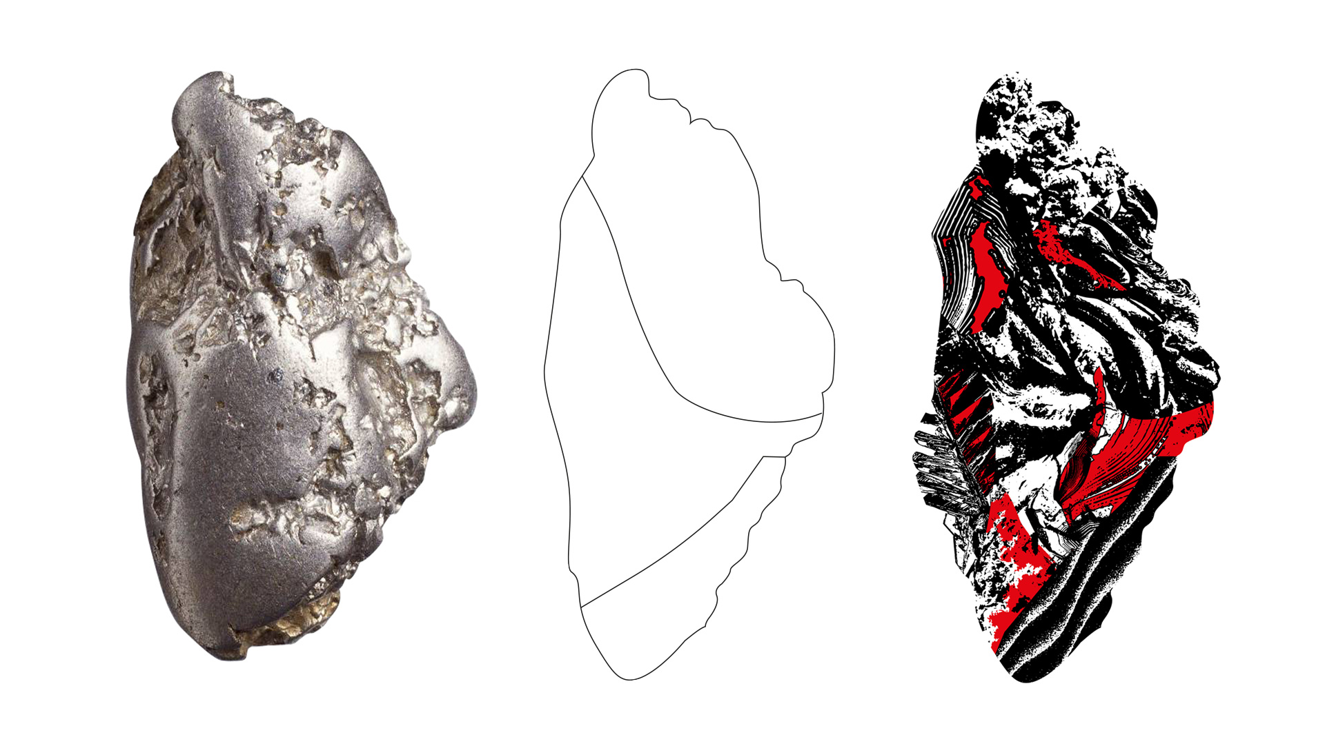

Chapter 2 : Savoir faire & craftsmanship
From raw element to refined material, this chapter is inspired by the shape and formation of precious stone and metal, from collection to manufacture. Chapter 2 includes 6 different design, all individually illustrating the beauty and power of craftsmanship in the world of jewelery.

Chapter 3 : The illuminated article
Encouraged by the precision and wonderful, sharp finishes this last chapter conclude the origin of wnder journey with 5 perfectly geometric and controlled design.

Client: Selfridges
Services : Concept, art direction, installation
Services : Concept, art direction, installation
Year: 2017
Location: Selfridges London Oxford St
Location: Selfridges London Oxford St
Branding
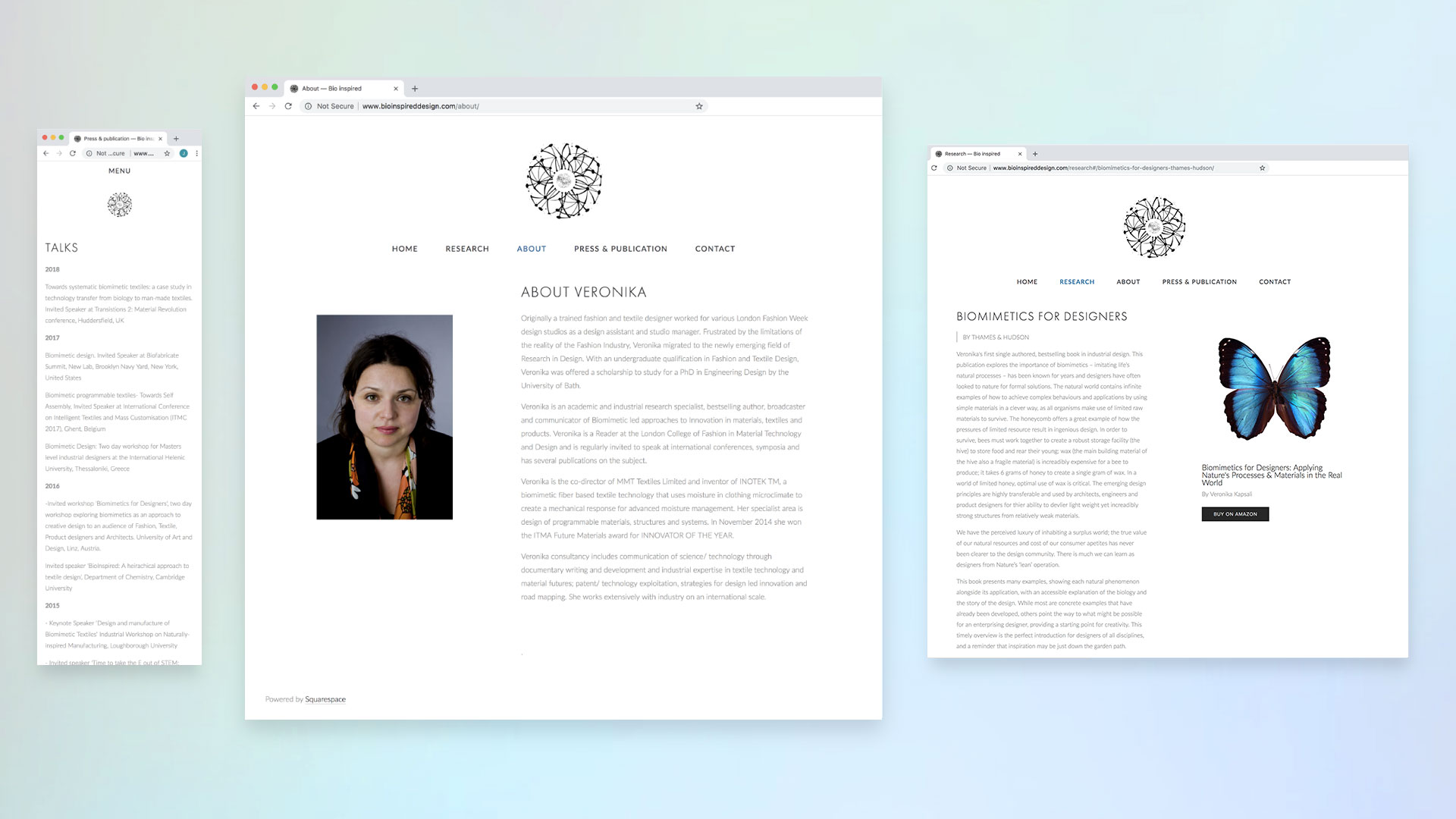
Bio Inspired by Design
Dr Veronika Kapsali is an academic and industrial research specialist, bestselling author, broadcaster and communicator of Biomimetic. Her word led to innovation in materials, textiles and products.
In the preparation of her first solo book launch, ‘Biomimetics for designers’ (Thames and Hudson) Dr Veronika Kapsali approached me to design the logo behind her practise ‘ Bio Inspired by Design’. Along with the logo, we set up a simple website, for her to be able to easily update and keep her followers updated about her last publication, talks and research.
Visit the website
Logo research and variation.
Client: Veronika Kapsali
Services : Branding + digital
Year: 2017
Animation: Wael Chams
Services : Branding + digital
Year: 2017
Animation: Wael Chams